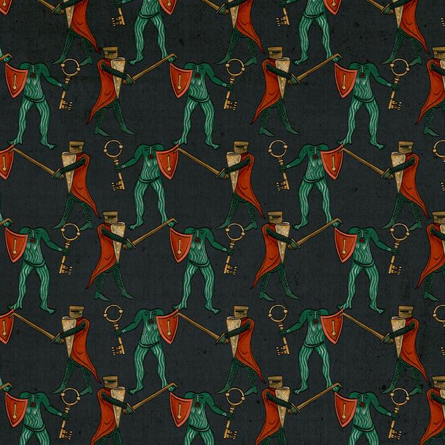
Medieval pattern by Self Studio for letter A
A

Behold, an unbreakable new visual identity for Apecs, one of the leading manufacturers of locks in the UK and the world.

Project name
Apecs
Timeframe
2 weeks
Service
Rebranding
Apecs Banner
Apecs damn invincible poster

Context

As a company operating since the 90s with a large existing clientele, one of the needs for Apecs was to preserve a flow of continuity from the original look & feel. At the same time, our brief was to create an identity that stands out on the relatively conservative and character-less market in the UK.
Apecs logo before and after
Apecs Logo before and after
Apecs magazine cover - The Lock that Keeps England Safe
Apecs Typeface
Apecs colour palette
Apecs rebranding - social media posts
Apecs poster 1
Apecs poster 2
Apecs poster 3
Apecs locks poster ad lock n' load
Apecs poster - the lock that holds the fort
Apecs packaging
Apecs conference cards
Apecs new product ad
Apecs website mobile version