
We occasionally get incoming briefs for cosmetic packaging design, asking for effective and appealing packaging. This article delves into how we approach design for organic brands compared to mainstream commercial brands, highlighting the distinct techniques and considerations for each.
We’ve written the below to fit different scenarios: whether a brand intends to sell on physical shelves or sell directly online (eg via Amazon or Shopify).
1. Client Briefs and Brand Identity
A big step in crafting any brand involves setting out the brief and conducting relevant research, understanding the existing market, how current and potential customers talk about the industry and what the client’s precise objectives are.
In particular, understanding the brand identity and target market is crucial. For organic brands, the focus is often on natural and sustainable aspects, while commercial brands might emphasize luxury or affordability. Our job is to ensure the packaging reflects these distinct identities and appeals to the respective target markets.
2. Design Techniques for Organic Brands
Once the brand objectives are set we move into the specifics of how to achieve them through design elements.
Organic brands typically favor simplicity and natural motifs. We use earthy colors, minimalist designs, and imagery of nature to convey a sense of simplicity and eco-friendliness. The material choices for organic brands lean towards recyclable or biodegradable options, aligning with their commitment to sustainability. This might involve wood, paper, card, perhaps with brown coloring to showcase a move away from use of paint or extra printing in the production stages.
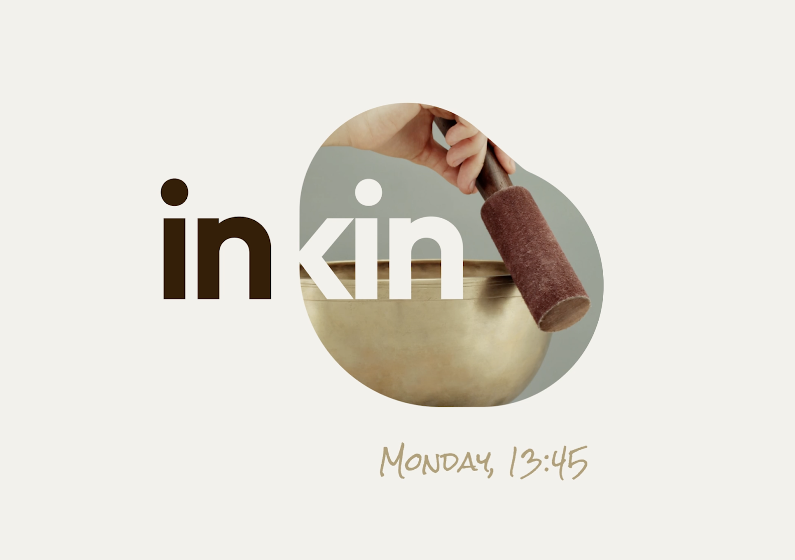
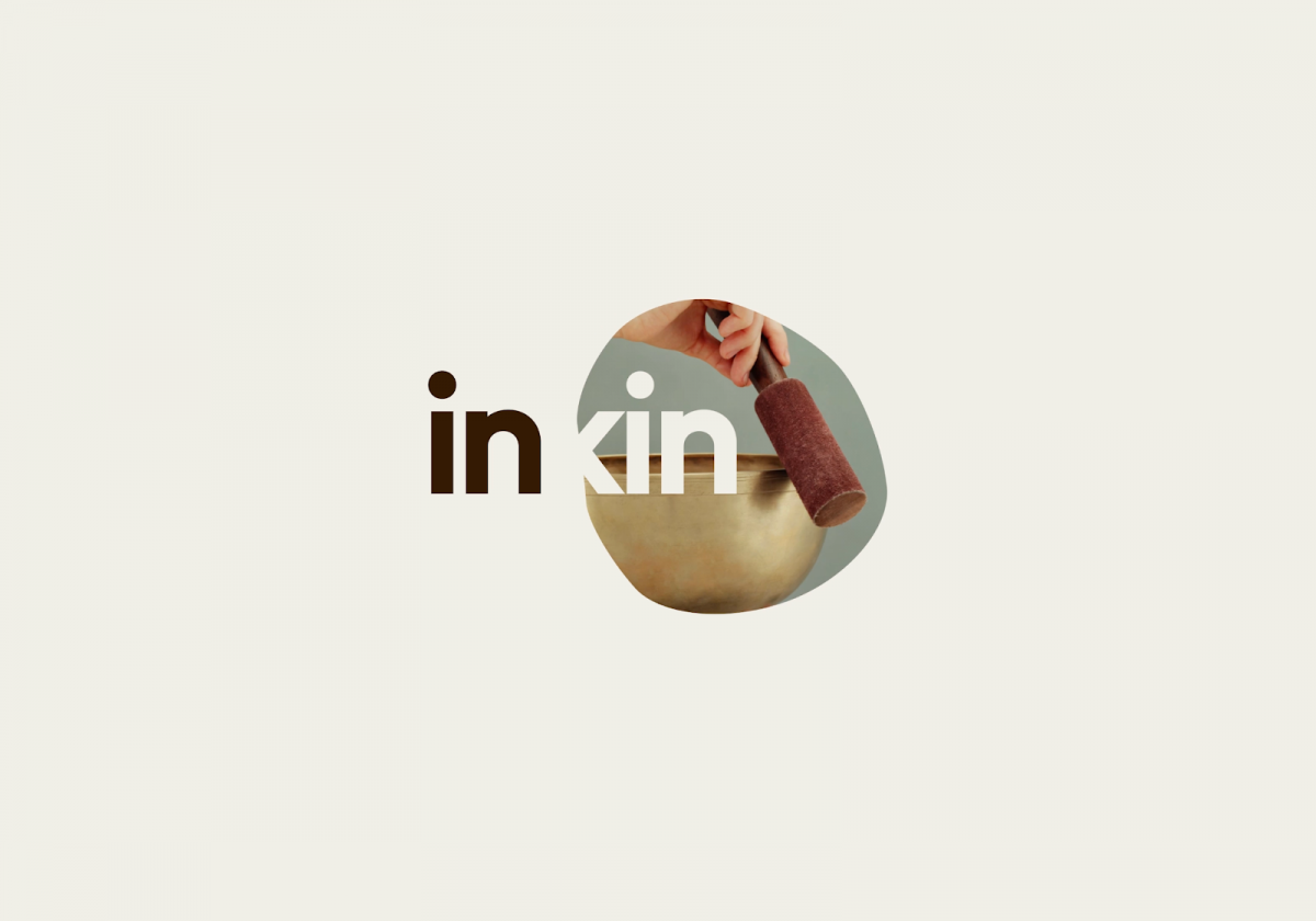
Although our client InKin is not a cosmetics company, there are parallels with the use of earthy colors, simple motifs and imagery invoking simplicity.
3. Messaging and Transparency
Transparency is particularly key in organic packaging. We ensure that labels are clear and informative, showcasing the product's natural ingredients and eco-friendly qualities. This builds trust with consumers who are conscious about product contents and environmental impact.
4. Mainstream Commercial Brand Techniques
In comparison, commercial brands often require more vibrant and bold packaging. We use a wider color palette, experimenting with high-contrast designs and modern typography to attract attention on crowded shelves. The packaging for these brands may involve innovative shapes and materials that stand out visually and tactilely.
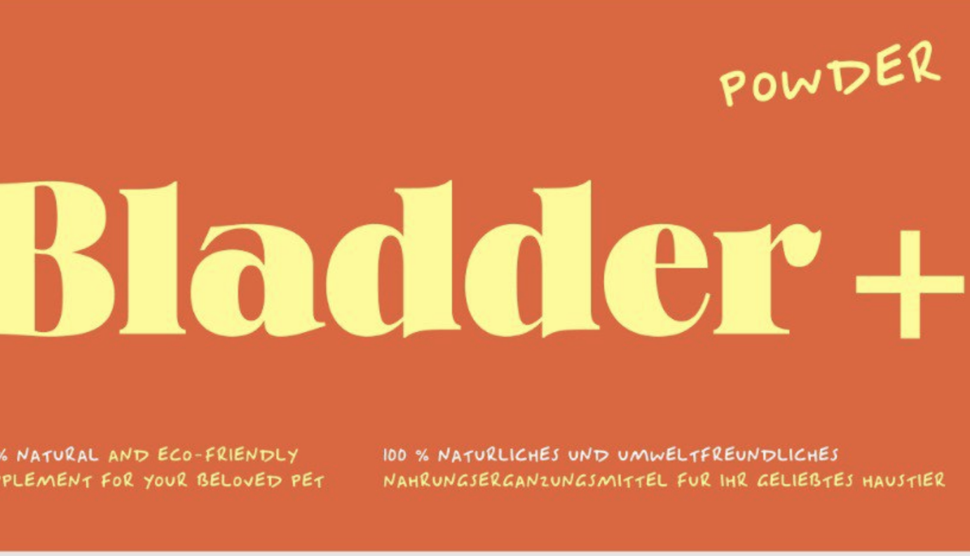
Mockup label for a German product helping dogs with bladder problems with high-contrast theme.
5. Branding and Luxury Elements
For many commercial brands, especially in the luxury segment, branding is paramount. We incorporate recognizable logos and patterns, and sometimes use metallic or glossy finishes to convey a sense of luxury and exclusivity.
Generally we tailor cosmetic packaging design to suit the specific needs of the client, and a lot depends on the existing brand assets, intended market positioning and product price. While increasingly popular organic brands typically focus on natural aesthetics and sustainability, commercial brands often opt for eye-catching and luxurious designs. Understanding these nuances allows us to create packaging that not only meets the clients' briefs but also resonates effectively with their target customers.
Remember, if you’re interested in exploring your branding in more detail and working on a project together, you can get in touch with us for a consultation!
